
Webflow says both are included with all plans at no extra cost. For site builders, this means dropdown panels, tooltips and sign-up prompts no longer require custom code or a third party tool.
What is new
- A popover element that floats next to the button that opens it, suited to menus, dropdown panels and tooltips.
- A modal element that takes over the page until a visitor closes it, suited to sign-up prompts, confirmations and forms.
- Both elements are in the element menu in the left sidebar and can be dragged onto the page.
- An "Animate open/close" option in each element's settings, with the animation editable in the Interactions panel.
- Availability on all plans at no additional cost.
Taken from the official update: webflow.com [1]
Which one to use for which job
Use a popover in Auto mode for a menu or tooltip. It closes when a visitor clicks outside, and opening another popover closes it. For a panel that should remain open while the visitor does something else, choose Manual mode. The popover closes when its button is clicked again, and opening another popover leaves it open.
Fact checked on 12 Nov 2026 against webflow.com [1], university.webflow.com [2]
Use a modal for a sign-up prompt, confirmation, or form that requires an answer before the visitor can continue. It takes over the page until the visitor closes it.
Fact checked on 12 Nov 2026 against webflow.com [1]
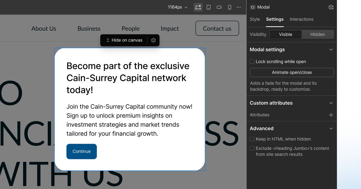
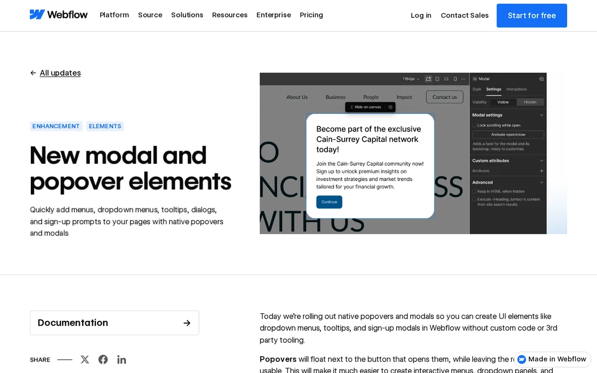
Webflow's own image of the Designer illustrates what a modal offers. The Settings tab includes a Modal settings group with a "Lock scrolling while open" checkbox and an "Animate open/close" button, along with a visibility switch and custom attributes.
Fact checked on 12 Nov 2026 against webflow.com [1]
How you open them and animate them
Set triggers on button elements. Webflow University's video says link elements lack the popover and modal trigger options, so a design that uses a text link to open a panel needs a button instead. A button can toggle, show, or hide a popover, which can be anchored to its trigger.
Fact checked on 12 Nov 2026 against university.webflow.com [2]
To add motion, choose "Animate open/close" in the element's settings, then adjust the result in the Interactions panel. To open a popover on hover rather than on click, the update says to add a Hover trigger.
Fact checked on 12 Nov 2026 against webflow.com [1]
What this replaces
Before this release, Webflow's modal tutorial created a click-triggered popup using a fixed, full-screen Div Block named Modal Wrapper. It contained another Div Block, a sign-up form, and a close link. Interactions initially hid the wrapper, showed it when the subscribe button was clicked, and hid it again when the close link was clicked. The tutorial required no custom code. Webflow's Calendly guide went further with third party popups, using a script in site-level Custom Code and an Embed element containing JavaScript.
Fact checked on 12 Nov 2026 against webflow.com [4], webflow.com [6]
Dropdowns were available under Add, then Other, as a built-in Dropdown element containing a toggle and a list. It could open on click or hover. A conference session transcript says native popovers let builders move away from the older dropdown element and its jQuery. Neither the update nor the video says the old dropdown is removed or must be changed, so existing builds are not described as affected.
Fact checked on 12 Nov 2026 against help.webflow.com [7], webflow.com [3]
Built on browser features, with modal accessibility handled
The update says popovers use the browser's Popover API, while modals use native dialog elements. Both appear in the browser's top layer. With modals, the browser makes the page behind inert, manages focus and the Escape key, and returns focus to the opening button when the modal closes. These are the tasks you no longer need to set up by hand.
Fact checked on 12 Nov 2026 against webflow.com [1]
The update leaves open what to check on your own sites. The notes specify no browser or Designer version requirements, so test a published page in the browsers your visitors use.
What the official notes do not say
- The update and the University video do not state a maximum number of popovers or modals per page or other element specific limits.
- They do not specify browser or Webflow Designer version requirements.
- They do not say the old dropdown element is removed, disabled or forcibly replaced. Only the conference transcript says builders can stop relying on it.
How it helps: a freelancer who builds sites for small businesses
The task. Add a newsletter sign-up prompt and a small help tooltip to a client’s home page without coding
- Drag a Modal from the element menu in the left sidebar onto the page.
- Put a heading, a short line of text and a sign-up form or button inside the modal.
- In the modal's Settings tab, select "Animate open/close" and fine tune the fade in the Interactions panel.
- Add a button elsewhere on the page and configure it to open the modal, since triggers are set on buttons rather than links.
- Drag a Popover next to a help icon button for the tooltip, and choose Auto mode so it closes when the visitor clicks elsewhere.
The result. The client receives a working sign-up prompt and tooltip made with native elements, while the browser handles the modal’s focus and Escape key behavior.
Fact checked on 12 Nov 2026 against webflow.com [1], university.webflow.com [2]
Other ways to use it
Webflow says the elements are included at no additional cost on all plans, so you can design with them on Starter. Webflow's help center says the free Starter plan lets you publish to a webflow.io subdomain, while a paid Site plan lets you connect a custom domain you own. The pricing guide explains the plan details.
Fact checked on 12 Nov 2026 against webflow.com [1], help.webflow.com [8]
Related nvudev guides
Sources
- https://webflow.com/updates/new-modal-and-popover-elements (official update)
- https://university.webflow.com/videos/popovers-modals
- https://webflow.com/webflowconf/session/everything-else-our-team-has-been-shipping
- https://webflow.com/blog/how-to-create-a-pop-up-modal-in-webflow
- https://webflow.com/blog/how-to-build-a-pop-up-modal-in-webflow
- https://webflow.com/blog/calendly-popup-modal-webflow
- https://help.webflow.com/hc/en-us/articles/33961310402067-How-do-I-add-a-dropdown-menu-in-Webflow
- https://help.webflow.com/hc/en-us/articles/33961232582419-Choose-a-Site-plan
Facts in this article were checked against these sources on 12 Nov 2026. Product details change, so check the official page before you rely on them.